So your bar has fallen into a design rut and you just can’t get out. Every day, customers and staff saunter into the establishment and are met with the same old color scheme, the same old fixtures and the same old decor accents.
If you like the design you’ve got going and business is hopping, don’t try to fix what isn’t broken. However, if you’re seriously in need of a mini makeover — or are simply craving change — there are ways to do so that won’t break the bank or force you to close shop for weeks on end.
Rearrange the furniture
Changing the layout of your home can make you feel like you’re living in a new space altogether. The same remains true for a restaurant or bar. The primary difference is that you want to keep clientele and staff in mind as you’re rearranging.
“Move furniture around to enable easier flow,” suggests Mariela Alvarez, an interior designer who’s been part of the ICRAVE design team for three years. Her focus is on food, space and design, and she combines those to encourage people to gather.
Alvarez says your goal is to make things comfortable for the customer, but to also consider the servers, as well. You’ll want them to be able to get drinks to clients as fast as possible. Arrange tables so that it’s easy to maneuver around them and keep paths clear and walkable. Also, create multiple paths so servers and customers don’t end up in a traffic jam.
Lighting
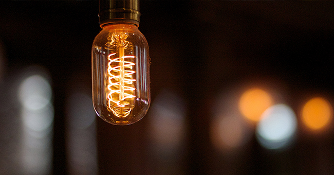
What’s the very first thing Michael Francis, the founding interior designer of Queue Design Agency, would do for a relatively quick and easy scenery update? Change the lighting. He notes that this can get expensive depending on how big your bar is, but that it’s money well spent. In fact, he suggests allocating half your design budget to lighting.
Start by replacing existing light fixtures, as they’re a major focal point.
“This is what sets the ‘mood’ of the space,” he explains. “Keep light levels low and highlight focal points.” Focal points include any recreational areas, lounging areas, and the bar itself.
“It’s always a good idea to illuminate bottle display behind bar,” he adds, noting that “uplight creates more magic.”
Alvarez agrees on the lighting front. “You can be energy efficient and sexy by using LED replacement lamps that are now available in warmer colors. Options 2700K and 2900K are ideal.”
Update the back bar
The other half of Francis’ design budget would go toward updating the back bar design, he says.
“The money should be spent waist-high and above,” notes Francis. In other words: focus on human sight lines. On that same note, he says to not spend money on flooring unless you’re okay closing shop for a while and you have a larger budget.
The back bar can be updated with new art, a new display case, lighting fixtures, and a paint job. Even taking everything down and removing the bottles one by one to detail-clean and dust can make a big difference in the overall vibe of your bar.
Invest in decorative features
On that same note, add new decorative features for your bar. That includes the back bar, the walls, the bathrooms and even entryways.
“Invest in a couple of feature decorative elements such as simple sconces, room-enlarging mirrors, and classic pendants,” says Alvarez.
It’s true what they say about mirrors: they make a space look bigger. Find one with a frame that suits your bar’s style and don’t settle until you find “the one.” Paintings, art and murals are also good options.
“If new objects are not accessible, give your bar an edge with found items,” suggests Alvarez. “Barn sales can be a great source of affordable items.”
Paint everything
Sounds a little overkill, but trust us on this. Paint everything in your bar (or as many things as you can muster). That includes the walls, ceiling and doors. You can also give the actual bar a fresh new coat of paint or wood stain.
“I suggest a sexy, bold color such as a dark gray-blue or a fresh, light gray,” says Alvarez. These colors are not too feminine or masculine, are calming, and look clean and fresh.
Francis recommends a simplified color palette across the board. This “will help unify the elements and not draw attention to any one piece.” Stick with a monochromatic color scheme and you’re good to go, he says.
If you’re not interested in changing your color scheme, at least address areas that are particularly worn-looking and need a new coat of paint. For something less work-intensive or dramatic, you can also try painting just one wall or the area behind the bar.
Unclutter
Really take the time and energy to address clutter in your bar. Maybe the back bar is overcrowded, the color scheme is too intense, or there’s too much on the walls.
“An organized bar is both good to look at and more efficient to work in,” notes Alvarez.
You don’t have to do it all in one day, but create a plan of action and attack every area of the bar until you’ve uncluttered and addressed it all. That includes the bathroom, the entryway, the back bar, lounging and recreational areas, the ceiling, the floors, walls and, of course, customer seating.


