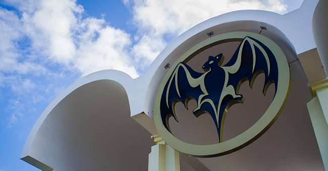
Few liquor logos are as iconic as that of Bacardí. For more than a century and a half, a bat with its wings proudly splayed out has represented the company’s resilience and determination and the Bacardí family’s persistence in an ever changing, unpredictable and competitive market. Over the years, the ubiquitous bat has gone through many iterations, playing varied roles for marketing campaigns and international celebrations of the brand. And it could be said that the powerful symbol was born of fate.
In 1862, Don Facundo Bacardí Massó and his wife, Amalia Moreau, launched a distillery in Santiago de Cuba, crafting rum that was uniquely smooth in comparison to fiery cane sugar spirits of that early era. It was in the original Cuban distillery that his wife discovered fruit bats hanging from the rafters. She took the creatures’ presence as a sign of good fortune (bats were thought to be a good omen back in the day, presumably before legends of vampires and other terrors of the night caught hold of our imaginations).
The Doña asserted that the bats should become the fledgling distillery’s mascot, believing that they would continue to ward off misfortune. Francisco Carrera-Justiz, a fifth generation member of the Bacardí family, postured that the fruit bats were attracted to the distillery by the captivating scent of molasses, but judging by the generations of success that Bacardí has seen, Doña Amalia may have been right. Not only are they harbingers of good luck, they actively improve the distillery’s ability to create rum — bats pollinate sugar cane and eat pesky bugs that threaten the crop. So, for more reasons than one, fruit bats deserve Bacardi’s thanks.

The Bacardí bat has changed in both subtle and more drastic ways since its original illustration. Photo courtesy of Bacardí.
The original Bacardí bat emblem was drawn in 1890. It featured a simple design of red and black, with a lifelike black illustration of the tiny flying mammal set against a red circle, outlined by black. After the Cuban War for Independence ended in 1898, the brand updated their logo to include “marca de fábrica,” which means trademark, and the bat was given further detail in the drawing. This version remained for more than 50 years, as the Bacardi name gained international acclaim. In 1959, the bat was given another update. This time, the famed fruit bat became more stylized rather than realistic, and gold was added as an accent to the signature emblem of red and black. More minor changes were made between 2002 and 2005 — the bat was made increasingly three dimensional, and the bat’s wings were drawn to exceed the confines of the logo’s circular outline. Also, for the first time, its head was drawn looking to the right, a departure from an image that had always been looking to the left. This shift was particularly poignant; the bat’s turn of attention is meant to symbolize the bat looking over the horizon at what’s to come, just as the Bacardi brand is committed to growing and changing to meet the needs of future generations.
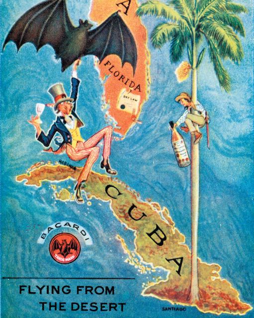
Over the years, the quintessential bat has appeared on more than just the Bacardí bottles. It’s served as a fundamental emblem on Bacardí facilities and in marketing materials. The bat logo is displayed proudly in statues and paintings, even at the bottom of extravagant fountains — it’s a prominent feature of all Bacardi facilities. And in a classic advertisement released during Prohibition to encourage Americans to travel to Cuba and drink Bacardi, a bat is pictured lifting an imbibing Uncle Sam from the States and pulling him over the ocean to its much less dry Cuban homeland.
It’s impossible to say where Bacardí would be if not for the bats that once dwelled in its distillery. Whether it was that they brought luck, pollination, healthy sugarcane crops or notoriety and brand recognition, the famed bats are an inextricable part of the company’s success — and a lucky logo, indeed.


